David Adjaye’s African architecture inspiration

By Laura Thomas

Producer, Dream Builders

_76314537_76314536

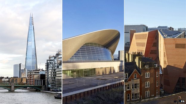
David Adjaye created the Moscow School of Management

Ahead of a new series of Dream Builders, architect David Adjaye talks to the BBC World Service about his latest projects and African inspiration.

Shortlisted for the RIBA Stirling Prize in 2006 for his Idea Store library in Whitechapel, the architect of London’s Stephen Lawrence Centre now finds himself working on commissions around the world.

It includes the Smithsonian National Museum of African American History and Culture in Washington and the Cape Coast Slavery Museum in Ghana.

It’s been a career which has seen the 48-year-old re-imagine the public library and create a vast new business school in Moscow, as well as being in demand for residential buildings – with commissions to create houses for actor Ewan McGregor and artists Jake Chapman and Chris Ofili.

Meanwhile, a unique project to document the architecture of Africa has been a constant source of inspiration to Adjaye.

Over the course of 10 years he visited every single African capital city (except one, Mogadishu, for safety reasons) and photographed the buildings he found. He travelled alone with his camera, leaving his team behind him.

“I was inspired by people like Atget’s documentation of Paris before Haussmann changed it,” he says. “I felt I knew the continent well and I realised I knew six countries really.

“I felt there was this incredible cavity on this huge continent. I realised my colleagues had no idea about it and I wanted to show there is an alternative modernism that had really erupted in the middle of the 20th Century.

“There is an African modernity as there is a South American modernity and an Asian modernity that we are now starting to learn about – a regional way of building which is affected by this climate and incredible geography and geology.”

Born in Tanzania in 1966, Adjaye also carries with him ideas formed during a childhood in which he moved from country to country many times with his diplomat parents before settling in the UK.

“I just took it for granted that in Tanzania you would have Sikh communities, Hindu communities, Muslim communities, indigenous Arab communities – that was the world I was born into,” he says.

“East Africa was full of that mix and I then moved to West Africa, which was colonial, but burgeoning with independence ideas, a new modernity being built, new ideas about music, life and literature.”

_76829209_stephen-lawrence-centre

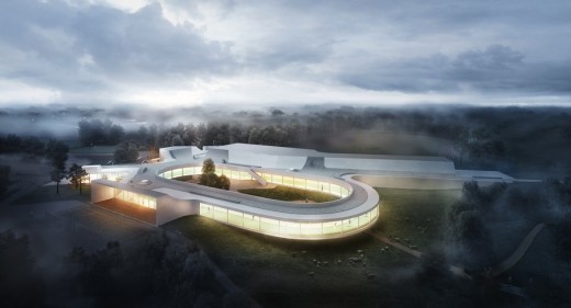
The Stephen Lawrence Centre is now protected by a security fence after being vandalised numerous times

Nevertheless the architect is understandably resistant to any attempt to pigeon-hole him as an “African Architect”.

“I am of a generation of architects that are thrown into the spotlight to negotiate this,” he says.

“I have a genetic relationship to the continent, also a cultural and lived relationship. I now have an office in Ghana and other places [but] I am less interested in the definition than I am in the way I can use it to produce in the world.”

What makes Adjaye unusual among architects is his willingness to admit a building can fail.

His Stephen Lawrence Centre in London, built as both a community centre and a memorial to the murdered black architecture student, has been vandalised many times since its completion, and is now protected by a security fence.

“Yes, the project has failed. It’s gated, it has security cameras everywhere and it has barbed wire. But that is because of the context we are in now. I hope that in 10 years or in five years this changes,” he says.

The architect is adamant even had he known what the building’s fate would be, he wouldn’t have changed his design: “To change the design would be to respond to vandalism.

“There was a discussion about bricking up the windows [but] I would say no – it’s better to fail but to have a strong position, than to make something nobody wants to go to.”

As Adjaye looks ahead to the completion of his museum building in Washington and Ghana, he believes the Stephen Lawrence Centre represents a vital connection with these other two, creating a triangle of buildings.

For him, they are an exploration of our global history and a re-imagining of the story of the “triangular” Atlantic Slave trade.

“It’s a story that is part of all of our collective psyches – it’s a way for people to understand the nature of the modern world.”

Taken from:

http://www.bbc.co.uk/news/entertainment-arts-28692859

Riba awards: London trio up for top architecture award

_76312421_sterling

The Shard, Aquatics Centre and London School of Economics’ student centre are three of six buildings nominated.

London’s The Shard, Aquatics Centre and the London School of Economics’ student centre have all been shortlisted for a prestigious architecture design award.

The Royal Institute of British Architects’ (Riba) Stirling Prize recognises excellence in buildings.

Six buildings have been recognised. The winner will be announced on 16 October.

Judges said the Aquatics Centre was a fitting backdrop for the Olympics; the Shard was a “great beauty” and the student centre was “startling”.

Of London’s architecture, Riba’s president, Stephen Hodder, said: “Almost every year there is a building from or around London that is shortlisted.

“There are two reasons for this; the quality of architects working in London and the amount of building activity in London. Also, behind a very good building there is a good client.”

Philip Gumuchdjian, chair of the Riba awards group which selected the shortlist, said London had been revitalised in the last 30 years.

“In 1980 there was a resistance to any foreign architect working in London or Britain, it was quite controlled.

“Now it’s more common and it’s added a great richness. It’s very cosmopolitan, just as London is.”

The Shard

_76314537_76314536

Mr Hodder said: “The Shard is a very significant and elegant addition to the London skyline but the tower also has to work well in terms of how it engages with the street.

“The skyline of any city is always changing. I recognise that we have to respect the historic view and at the moment there’s a debate about tall buildings. But the Shard does not impact on the historic views but adds to it.”

“Whatever position you take, as you look across the London skyline your eye immediately goes to it; you almost don’t see the other buildings,” said Mr Gumuchdjian.

“The building is literally five shards of glass resting on each other, it’s pure sculpture.”

The building was designed by Renzo Piano Building Workshop.

Rory Olcayto, the editor of the Architects’ Journal, said the Shard marked the point of London’s origin; “like a giant flagpole it pinpoints the location of where Romans first crossed the Thames and then founded ancient Londinium”.

“It means so many other things too: it is a symbol of London’s reliance on overseas wealth, in that it was funded in the main by Qatari money.

“But it is also a symbol of how lofty London’s success has been in recent years compared with the rest of Britain.”

Aquatics Centre
Although it was built for London 2012, this is the first time the centre has been submitted for this award as the plan was for it to be judged after the legacy changes had been completed.

Designed by Zaha Hadid Architects, the building saw its wings, which were used to seat spectators during the Games, removed so that it could be turned into a swimming facility used by everyone.

“There’s serenity about the building which captures the spirit of water and the activity that goes on within,” said Mr Hodder

_76314501_76314500

The Aquatics Centre was used in the Olympics for the swimming and diving competitions
“If sport – and keeping fit – is Britain’s new religion then Zaha Hadid’s Aquatics Centre is the cathedral we want to worship within,” said Mr Olcayto.

“It’s cavernous interior is among the greatest of public spaces anywhere in Britain.”

London School of Economics
Mr Olcayto said the Saw Swee Hock Student Centre, designed by O’Donnell and Tuomey Architects, “transformed how we perceive this world famous institution”.

_76314499_76314498

The judges said every angle responded to the rights of its neighbours to light
“Everyone has heard of the LSE but few would be able to tell you what it actually looked like.

“No longer: now it has a striking landmark – and unlike other more recent icons, it fashioned from London’s traditional building blocks – bricks – rather than steel and glass.”

The building is made up of 46 standard shape bricks, 127 special bricks out of a total of 175,000, and not a single cut brick.

Mr Hodder saw the LSE building for the first time on Tuesday.

“I find very rarely do you come across a building which is truly original.

“When you delve beneath it all it is a very pragmatic solution to building in a very dense urban area.”

Taken from: http://www.bbc.co.uk/news/uk-england-london-28336957

Cities need Goldilocks housing density – not too high or low, but just right

The trend for elite towers that reach ever skywards isn’t healthy for a sustainable community or for a balanced quality of life.

view from New York's tallest residential skyscraper, One57 on to Central Park

The view from New York’s tallest residential skyscraper, One57 on to Central Park. Photograph: Christina Horsten/dpa/Alamy Live News

In London, Boris Johnson brushes aside opposition to a new development scheme at Convoys Wharf that might threaten the remains of the Royal Dockyard at Deptford. He says: “We need to build thousands of new homes in the capital and proposals to do that at Convoys Wharf have stalled for far too long.”

In Toronto, where I live, theatre impresario David Mirvish (whose dad owned the Old Vic) is knocking down four designated heritage buildings to build three 85-storey Frank Gehry towers. But as Chris Hume of the Toronto Star notes, “There are two types of heritage, let’s not forget: one we inherit; the other we bequeath.”

In New York, sleek new towers for the tenth of the 1% are rising through previously sacrosanct height limits. These are hugely expensive to build, but get such high prices that there seems to be no limit to how high or how skinny they can go. Critic Michael Kimmelman sums up the problemin one sentence: “Exceptional height should be earned, not bought.”

In so-called hot cities such London, Toronto and New York, the planners and politicians are letting a thousand towers bloom. In others such as Seattle, Washington or San Francisco, battles are raging over height limits and urban density, all on the basis of two premises: 1) that building all these towers will increase the supply of housing and therefore reduce its costs; 2) that increasing density is the green, sustainable thing to do and that towers are the best way to do it.

I am not sure that either is true. I am an architect and I certainly consider myself an environmentalist, but it appears to me that in a lot of cities, these new glass towers don’t add much at all to the city in terms of energy efficiency or quality of life. Often they don’t add many more housing units than the buildings they replace. I am also a heritage activist, not because I particularly love old buildings, but because there is so much to learn from them and from the neighbourhoods. and cities that were designed before cars or electricity or thermostats, and were built at surprisingly high urban densities.

There is no question that high urban densities are important, but the question is how high, and in what form. There is what I have called the Goldilocks density: dense enough to support vibrant main streets with retail and services for local needs, but not too high that people can’t take the stairs in a pinch. Dense enough to support bike and transit infrastructure, but not so dense to need subways and huge underground parking garages. Dense enough to build a sense of community, but not so dense as to have everyone slip into anonymity.

Harlem Brownstones, in Manhattan, New York

Harlem Brownstones, in Manhattan, New York. Low-rise homes make for a better neighbourhood and population density than the super high rise. Photograph: Alamy

At the Goldilocks density, streets are a joy to walk; sun can penetrate to street level and the ground floors are often filled with cafes that spill out onto the street, where one can sit without being blown away, as often happens around towers. Yet the buildings can accommodate a lot of people: traditional Parisian districts house up to 26,000 people per sq km; Barcelona’s Eixample district clocks in at an extraordinary 36,000.

Building tall does not necessarily even increase residential density; in fact, it can do the opposite. In New York’s tall, slender towers, the elevators and stairs take up a huge proportion of the floor space, and there is lot of expensive exterior wall for each unit. The construction costs for this kind of building are ridiculous, and only the very, very rich can afford to pay the price, so apartments are therefore often huge as well; consequently the population density can actually go down.

There is less street life too, as ground floors are taken up with lobbies and exits and ramps instead of stores and restaurants. The great majority of the new projects that are busting through height limits, view corridors and historic districts do nothing to ease the housing crisis and nothing to improve the urban fabric.

At the Goldilocks density, construction is a lot cheaper and the buildings a lot more efficient; in Montreal’s Plateau district, the buildings are mostly just three storeys high, with exterior stairs. Every inch of interior space is used for living, making them almost 100% efficient, and accommodating over 11,000 people per square kilometre. New, greener forms of construction can be used, as Thistleton Waugh did with their 12-storey timber tower in London’s Hackney. In Toronto, architects such as Roland Rom Coltoff of RAW are rebuilding and revitalising neighbourhood high streets with very attractive, modern low-rise buildings, putting the housing where you want it, near transit and schools.

Building to the Goldilocks density is also more resilient: it’s easier to get in and out of your flat when the power goes out when you live on the fourth floor than when you live on the 40th. After Superstorm Sandy, the older walkups in New York’s Lower East Side were reoccupied a lot more quickly than the taller towers with flooded elevators and elaborate electrical systems.

It is not a coincidence that the lower but dense patterns of development seen in Paris, Barcelona and Montreal were built before there were cars. People tended to live in smaller flats, closer together, with narrower streets that acted as their living room, pantry and entertainment centres. They still do today, and as cars are often so inconvenient to park, it is easier to walk or cycle. Not surprisingly, by occupying less space and not driving, they have a lower carbon footprint per capita.

There is lots of room in our cities to do this: not everyone has to live in Chelsea on either side of the Atlantic. New York isn’t even particularly dense, at 2,050 people per sq km, even less than Toronto’s 2,650, which is half of London’s 5,100, which still puts it only 43rd on the list of densest cities. They’re just spiky. Get out of the hot spots and a there’s lots of room to grow.

Economists such as Ed Glaeser would flatten neighbourhoods like Greenwich Village and fill them with 40-storey towers, claiming that increased supply will lower the cost of housing. Economist (and Economist correspondent) Ryan Avent says much the same thing, noting that nimbys use zoning rules, historical designations and public pressure “to preserve neighbourhoods, views, and buildings they love from changes they fear”. They would let Adam Smith and the law of supply and demand decide how our cities are built.

The key to building a healthy and green city isn’t putting wind turbines on the roof of a glass tower; the way to solving our housing crises isn’t handing the keys to the planning office to a bunch of living and dead economists. It is to build walkable and cyclable communities at the Goldilocks density: not too high, not too low, but just right.

 Taken from: http://www.theguardian.com/lifeandstyle/2014/apr/16/cities-need-goldilocks-housing-density-not-too-high-low-just-right

Battersea Power Station: last chance to see inside

The Telegraph visited Battersea Power Station before it changed forever – watch this film to get a rare look inside the Grade II listed building.

In November 2013 The Telegraph was one of the final visitors to Battersea Power Station, gaining rare access to the building before its regeneration began.

Now the architects and developers behind the transformation of the building have unveiled plans for phase three of the 10-year project.

The Battersea Power Station Development Company and architects, Gehry and Foster, have presented designs for a new high street, called the Electric Boulevard, to be built on the former industrial land.

battersea-power-2_2875772c

This will form the main gateway to the complex. The heritage building, once a symbol of British industry, had been abandoned by consultants and developers until a consortium of Malaysian investors rescued the site, funding the regeneration of the deserted chimneys and engine rooms into luxury penthouse apartments.

battersea-power-4_2875771c

The third phase will also deliver over 1,300 apartments and town houses, including 130 affordable homes, alongside a 160-room hotel, retail and leisure facilities.

When completed the whole complex, overlooking the Thames, will bring more than 3,400 homes to the south west London borough.

battersea-power-1_2875770c

Construction has already started on phase one, known as Circus West, while work on the restoration of the Grade II listed towers will commence this year.

Taken from: http://www.telegraph.co.uk/telegraphtv/10750112/Battersea-Power-Station-last-chance-to-see-inside.html

Work begins on the world’s first 3D-printed house

Zero waste, lower transport costs and recyclable materials – is 3D-printing the future of housebuilding? Dutch architects are putting the process to the test for the first time in Amsterdam.

Netherlands Printing A House

3D-printed house … The future of volume house-building, or a novelty technology for temporary pavilions? Photograph: Peter Dejong/ASSOCIATED PRESS

Treacle-black plastic oozes from a nozzle at the bottom of a small tower in Amsterdam, depositing layer upon layer of glistening black worms in an orderly grid. With a knot of pipes and wires rising up to a big hopper, it looks like a high-tech liquorice production line. But this could be the future of house-building, if Dus Architects have their way.

On this small canal-side plot in the north of the city, dotted with twisting plastic columns and strange zig-zag building blocks, the architects have begun making what they say will be the world’s first 3D-printed house.

“The building industry is one of the most polluting and inefficient industries out there,” says Hedwig Heinsman of Dus. “With 3D-printing, there is zero waste, reduced transportation costs, and everything can be melted down and recycled. This could revolutionise how we make our cities.”

Working on site for three weeks, the architects have so far produced a 3m-high sample corner of their future house, printed as a single piece weighing 180kg. It is one of the building blocks that will be stacked up like Lego bricks over the next three years to form a 13-room complex, modelled on a traditional Dutch gabled canal house, but with hand-laid bricks replaced by a faceted plastic facade, scripted by computer software.

<p><a href=”http://vimeo.com/90333642″>3D Print Canal House – Element 002</a> from <a href=”http://vimeo.com/user9732280″>3D Print Canal House</a> on <a href=”https://vimeo.com”>Vimeo</a&gt;.</p>

At the centre of the process is the KamerMaker, or Room Builder, a scaled-up version of an open-source home 3D-printer, developed with Dutch firm Ultimaker. It uses the same principle of extruding layers of molten plastic, only enlarged about 10 times, from printing desktop trinkets to chunks of buildings up to 2x2x3.5m high.

For a machine-made material, the samples have an intriguingly hand-made finish. In places, it looks like bunches of black spaghetti. There are lumps and bumps, knots and wiggles, seams where the print head appears to have paused or slipped, spurting out more black goo than expected.

“We’re still perfecting the technology,” says Heinsman. The current material is a bio-plastic mix, usually used as an industrial adhesive, containing 75% plant oil and reinforced with microfibres. They have also produced tests with a translucent plastic and a wood fibre mix, like a liquid form of MDF that can later be sawn and sanded. “We will continue to test over the next three years, as the technology evolves,” she says. “With a second nozzle, you could print multiple materials simultaneously, with structure and insulation side by side.”

For now, these plastic blocks, which are printed with a honeycomb lattice within for reinforcement, are back-filled with lightweight concrete, for structural strength and insulation – which would make recycling the parts somewhat difficult.

“It’s an experiment,” says Heinsman. “We called it the room maker, but it’s also a conversation maker.” Over 2,000 people have already visited the site, from building contractors to coach-loads of architecture students, while even Barack Obama was shown the prototypes when he was in Amsterdam last week.

“This is only the beginning, but there could be endless possibilities, from printing functional solutions locally in slums and disaster areas, to high-end hotel rooms that are individually customised and printed in marble dust.”

While Dus may be the first architects to start printing a full-scale house, they join a number of others who have been experimenting with printing at an architectural scale over the last few years. Since 2008, researchers at the University of Southern California have been developing a technology, known as contour crafting, that uses acomputer-controlled gantry to print structures in quick-setting concrete, which they say is potentially capable of printing high-rise buildings, with the printer climbing the structure as it grows. Another Dutch architect, Janjaap Ruijssenaars, is working on a project to print a house shaped like a looping Mobius strip with the Italian-made D-Shape printer, which uses sand mixed with a binding agent to create a form of synthetic sandstone. So far, only a small pavilion-sized structure has been printed. This looks to be where the technology will remain for the time being: temporary novelty structures for exhibitions and events.

“One of my fantasies is printing in biodegradable materials for festivals,” says Heinsman. “You could print an outrageous tent structure, then after a couple of years and few rain showers it disappears.”

Taken from: http://www.theguardian.com/artanddesign/architecture-design-blog/2014/mar/28/work-begins-on-the-worlds-first-3d-printed-house

Sauflon Centre of Innovation

The ethereal centre of innovation project, unveiled in Hungary, stands for the mutual inspiration of science, technology and art. A twenty four meter passage surrounded by the reflections of reflections. Foldes Architects involved a glass sculptor to compose the illusion effects engaging the visual notion of all visitors.

sauflon-centre-of-innovation-f180314-tb-10-400x400


Despite the economic challenges of the last years, the contact lens industry remained remarkably prosperous. A leading producer of contact lens and aftercare solutions, Sauflon, decided to establish a part of their lens production in Hungary. A decision, which was followed by the foundation of a subsidiary company in 2005. The opening of the Hungarian production facility ensured a 35% yearly growth, therefore in March 2012 the British parent company decided to create a centre of innovation in Hungary to present the latest technologies in the form of a first class business and clinical training series of inspiring spaces. Five local architectural studios had been invited to tender for the project, which was eventually won by the renowned Foldes Architects.

Laszlo Foldes, chief designer of Foldes Architects, explained the concept that lay behind his company’s presentation.

‘The task was to create an iconic yet functional centre of innovation which mainly serves as the showcase for the high-tech, innovative production methods used in the manufacturing of the latest generation, high-quality contact lens products of Sauflon. 700 people in 4 shifts work daily at the factory which shares the space with the centre of innovation. Though lens production can’t be compared to average factory operation it still meant the industrial to us. It challenged our minds how to couple it to a pure, event and conference oriented, guest welcoming, elegant space. The concept derived from the definition of lens, the means of vision, and also we took inspiration from the high-technology of the lens industry, therefore clean, intelligent, integrated solutions as well as playful reflections, gloss surfaces and transparency played great importance during the design. This concept is supported by the resin flooring, the glass bridges, the opened-up volume and the tremendous flow of light streaming through the glass façade and the glass roof.’ He said.

Some 20 kilometres South of the capital, Budapest, in the heart of a modern industrial park, among bunches of metal masts, this hidden beauty is waiting for visitors from other lands. The physical production process is settled in the same building, only a door divides it from the centre of innovation space. To the façade a huge glass surface is used to maximize the amount of light flowing in. After entering, the 10 meter high volume remains open and a 24 meter-long passage welcomes visitors with a sloped glass surface at the end which tricks the vision. On the right hand side the core functions are located: first a lounge with a 24m2 glass wall presenting the visual ID of the company, then a cloakroom hidden by ‘floating’ glass doors and finally the rebel pink glass covered cafe including kitchen and the mechanical room behind. Above, a wooden box is cantilevered, a house within the house, which serves as an auditorium with 32 seats and an integrated interpreter-cabin for conferences. The box can be entered from the upstairs guest area, through two green glass bridges. The next bridge gives access to the fitting room where clinical training is delivered and the newest lenses can be experienced. A 12 seat meeting room can be reached through the same bridge. On the ground floor a white door opens up the secret of the Sauflon Centre of Innovation – visitors can enter the production area here which provides a unique opportunity to gain an insight into the technologies used by one of the most pioneering companies in optics. An iconic text welcomes their arrival: ‘Innovation is at the heart of everything we do.’

Collaborating glass sculptor, Andras Bojti remarked: ‘Our aim was to create and present all details in relation with each other, which resulted in a special experience for visitors, they sense the unity of the layers and surfaces based on these relationships, while moving around the centre. Thanks to the shared work with Laszlo Foldes and his team the result challenges the visitors in all possible ways: visually, spiritually and intellectually. This is an emblematic project that stands for the shared thinking process of a sensitive architect and an independent artist, also of the collaborative work model, and the implementation of a sculptor’s vision into a physical space. The therapeutic effect is the core of this project; the creation of an atmosphere to influence people enjoying exceptional experiences.’

Laszlo Moholy-Nagy, Hungarian origin artist of the 20th century drew the attention of the public to the importance and meanings of vision through his art works, theories and books, among which the Vision in Motion, speaking about the ‘man’s fundamental qualities, of his intellectual and emotional requirements, of his psychological well-being and his physical health.’ All of these facets of the human experience were used in this exciting new project.

Project name: Sauflon Centre of Innovation
Location: Gyal, Pest County, Hungary
Program: Innovation Centre attached to Sauflon contact lens factory
Type: competition commission
Area/Size: 730 m2
Year: Design: 2013 • Completion: Nov 2013
Cost: 850.000 EUR
Client: Sauflon CL Kft.
Project by: Foldes Architects (http://www.foldesarchitects.hu/)
Principal Designer: Laszlo Foldes
Project Design Team: Johanna Csuri, Tamas Holics
Co-designer glass sculptor: Andras Bojti

Images: Tamas Bujnovszky
Text: Viktoria Szepvolgyi

Taken from: http://www.e-architect.co.uk/hungary/sauflon-centre-of-innovation

RISING TO THE TOP

Gehry designing the tallest tower in Berlin.

01-frank-gehry-berlin-archpaper


Gehry Partners has won a competition to design Berlin’s tallest building and first new residential skyscraper in over forty years. The Die Mitte tower is being developed by Houston, Texas–based international real estate firm Hines, and will go up next to the company’s Die Mitte retail building in Alexanderplatz square. The 500,000-square-foot building will be 492 feet tall and contain 300 apartments and a hotel.

Gehry’s cream-colored design, clad in stone, features a spiraling tower in three segments. The lowest portion of the building is articulated as a cluster of smaller towers, while the central portion of the building rises as a more subtly undulating single volume. The third tier of the skyscraper again splits into apparently separate blocks, rotated against and seeming about to lift off of the central section.

The tower is Gehry Partners’ third collaboration with Hines. The firm designed the Hines-owned DZ Bank, also in Berlin, as well as the New World Center in Miami Beach, Florida.

Gehry Partners beat out nine other firms, including Adjaye Associates and Architectonica, for the commission. “In order to transform the square we want to take a chance on something new and exceptional,” said Christoph Reschke, co-managing director of Hines Immobilien GmbH.

Not everyone in Berlin is thrilled with the competition’s outcome. At least two of the German firms submitting designs have questioned whether the jury placed too much faith in the so-called “Bilbao effect,” the power of a Gehry building to spur revitalization. In an interview with The Guardian, competition participant Hans Kollhoff criticized the Gehry design as lacking relevance to everyday life in Berlin. Kollhoff has a long history with the Alexanderplatz site, as the author of a 1993 plan to place ten towers around the square.

Anna Bergren Miller
Taken from: http://www.archpaper.com/news/articles.asp?id=7143

Langvang Multifunctional Sports Building

Design: Elkiær + Ebbeskov and LETH & GORI

A team lead by architects Elkiær + Ebbeskov and LETH & GORI has been announced as the winner of Randers Municipality and The Danish Foundation for Culture and Sport Facilities’ competition for the Langvang Multifunctional Sports Building. The proposal by E+E and LETH & GORI was selected after a 2-phased competition. Competing teams were led by Dorte Mandrup Arkitekter, CEBRA, COBE and Kontur.

langvang-multifunctional-sports-centre-l100314-bi-2-520x281

The 5.300m2 large project with a budget of 52.6 mil. DKK is a combined sports hall and
community centre consisting of a series of different multifunctional arenas for activities and
events. The programme includes indoor athletics facilities with a 200m running track, 60m
running track, and facilities for high jump, long jump, pole vault, javelin, discus, hammer
throw and short put, along with different arenas for sports , a 200m roller skating track, play areas, dressing rooms, offices and meeting facilities for the sports clubs and a café.

langvang-multifunctional-sports-centre-l100314-bi-1


The building is based on an idea of double programming of space – for example double use of the indoor running tracks for roller skating or fencing. Another example is mattresses for athletics that are used for martial arts and high rope climbing routes. A unique space designed especially for women double functions as a dance hall and a multipurpose hall for meetings, concerts, theatre or parties. The roof of the building is also designed as an activity landscape which facilitates runners, skaters, bikes, roller skating and skiing in wintertime.

It is a type of multifunctional sports building we have not seen before and maybe the most innovative one ever (…). It will be a sculptural building that merges with the surrounding nature and dissolve the borders between being active inside and outside. (…)
Torben Frølich, director of The Danish Foundation for Culture and Sport Facilities

In addition to the building the competition also included a masterplan of the surrounding areas for sports and recreation.

A melting pot
The vision for the Langvang project is to create a place where differences can meet. It is a project where inside and outside melts together and where professional and recreational programmes can meet and co-exist in an open and inviting environment. The project releases the unique potential of the site by creating a unique meeting place where people can be active individually and as a community. A new sports landmark in Randers.

In Randers we have a dream of creating a new hub for sport and activity. A unique place for allcitizens of Randers. A place that unites sport, integration, health and nature. Our aim is to make a success, that will create precedent in the whole country, as well as abroad.
Claus Omann Jensen, Mayor of Randers

The Langvang project is an open invitation to everyone despite age, experience and physique. The building and surround landscape supports events and activities of all kind.

Taken from: http://www.e-architect.co.uk/denmark/langvang-multifunctional-sports-centre

A Chinese developer plans to rebuild London’s ‘heroic’ Crystal Palace – but will it be a new building or a piece of ‘duplitecture’?

With its very light weight and advanced modular construction – inspired by railway technology and designed in a mere seven days – the Crystal Palace of 1851 sits very heavily on our collective consciousness. The most heroic building of all time? Very possibly. It always was, and is again today, a test for taste.

pg-38-crystal-pal-gillard

The great Victorian critic John Ruskin disliked the Crystal Palace, dismissing Joseph Paxton’s ingenious design as a “giant greenhouse”. Ruskin’s aversion to sex might have been excited by the suggestive, intromittent action of the vast steam engines’ pistons, which were some of its exemplary exhibits.

The year 1851 was perhaps the absolute top dead centre of the rising curve of British power and prestige: The Great Exhibition was its advertisement. And with symbolic precision, the structure was painstakingly removed to Sydenham, where it burnt magnificently to the ground on 30 November 1936.

Now the Chinese developer ZhongRong Group of Shanghai proposes to rebuild it. ZhongRong has, as visitors to Pudong know, better credentials as an enthusiastic developer than a tasteful patron. There are other artistic problems. The US architectural historian Bianca Bosker has given us a useful term: duplitecture. The Chinese, if one may generalise, do not have a European view of authenticity. Recent research shows that the Chinese, busy on merciless campaigns of trophy shopping, thought Gucci was British.

The same category error applies to architecture. There are many gross examples of duplitecture in mainland China. I am especially fond of the fake Champs Elysées in Zhejiang, which culminates in a 300ft Eiffel tower, sadly located in a dismal, litter-strewn field. Nearby, is a replica of the Piazza San Marco in Venice, which ingeniously doubles as a basketball court.

No one is quite sure what to expect in Sydenham-Penge, although I do not expect great wonders. A 1990 Act of Parliament requires any new building on the site to acknowledge the “translucent and delicate” original. And to be similar in size. If a crass copy is going to happen, we know what to expect: a developer called Trammell Crow built InfoMart in Dallas in 1985. Like Susan Sontag’s definition of camp, it is bad to the point of being ridiculous, but not to the point of being funny.

What might we expect of the shortlisted architects going to work with ZhongRong’s capitalist tools on the Sydenham-Penge borders? Will they be constrained or let their imaginations soar? Zaha Hadid now partners Anish Kapoor: each specialises in over-sized fatuous bio-morphic one-liners of limited functionality. Nicholas Grimshaw is an architect who may be considered by some to have his best work behind him, as is Richard Rogers. David Chipperfield is an unstoppably ambitious technocrat, two steps behind popular taste. More modest practices are Marks Barfield, masters of entertainment architecture with the London Eye and the Tate Pier to their credit, or Haworth Tompkins, whose ingenious remodelling of the London Library was handled with great tact. Only the ever-eager Norman Foster is missing.

Will we get duplitecture or a fine new building? Inspiration and duplication can easily be confused. Do we live in a world where nothing is new, where everything is a re-edition, a reflection or a reworking of something else? Then again, why do the Chinese want to “fake it”? More importantly, why do we let them do it?

Prince Albert had vision and confidence of historic significance. That’s why we remember his Crystal Palace. Whether we have architects with audacity and vision and genius to match Albert and Paxton we will soon know. Personally, I doubt it. Penge will soon be Pudong and the proud among us will weep.

Taken from: http://www.independent.co.uk/arts-entertainment/architecture/a-chinese-developer-plans-to-rebuild-londons-heroic-crystal-palace–but-will-it-be-a-new-building-or-a-piece-of-duplitecture-9171791.html

LSE’s new students’ union: a lesson in architectural origami

In the Saw Swee Hock Student Centre, O’Donnell and Tuomey have produced a fold-out marvel that ducks and dodges between its neighbours’ rights to light.

SAW SWEE HOCK STUDENTS' CENTRE


Bricks don’t usually bend, or fold, or hang like sumptuous curtains. But then most bricks aren’t arranged with the mastery of Irish architects O’Donnell and Tuomey, or with the patronage of a client such as the London School of Economics. The two have come together, in the tangle of medieval lanes behind Aldwych in central London, to achieve gymnastic feats with humble blocks, producing an angular avalanche of a building that appears to tumble precipitously in all directions.

This striking piece of redbrick origami is the school’s £24m new Saw Swee Hock Student Centre, a souped-up home for the students’ union that is as energetic on the outside as the activities going on within.

“It’s a bit like a cruise ship,” says Sheila O’Donnell. “A great stack of different functions, from a nightclub and gym, to cafes and prayer rooms, all these bits of different shapes and sizes interlocking together in a complicated jigsaw puzzle.”

Shoehorned into an unpromising triangular site, the building has to limbo beneath a plethora of invisible restrictions, ducking and dodging below its neighbours’ rights to light. “We took these limits as a corset, not a form-giver,” says John Tuomey, explaining how they made a perspex “jelly-mould” of the maximum possible envelope, like a New York cityscape silhouette, which was then used to test their cardboard models.

A literal product of its surroundings, the form was then sculpted according to views down the narrow winding streets, such as from Lincoln’s Inn Fields and St Clement’s Lane, the folds of its facade determined by diagonals between pavements and rooftops. The result is a shapeshifting mass, chiselled into its form by an intricate web of urban ley lines.

Saw Swee Hock Student Centre.

An interior shot of the centre. Photograph: Nigel Stead/LSE Images

If it forces a double-take, that is part of the intention – to give presence to this 12,000-strong institution, which has been housed in largely anonymous buildings for the last hundred years. The buffeted envelope is designed, says Tuomey, to “disturb the street, to suck the pavement into the building and take it for a vertical walk”. When the paving is finished, it will run seamlessly from street to foyer to a chunky concrete staircase that splays open to entice people to the levels above.

“We see this staircase as part of the medieval street pattern,” says O’Donnell. “It is a public route with different facilities spilling off it, each managed by different people.” There are no swipe-card doors and, like the rest of the LSE campus, which spreads from Kingsway to the Royal Courts of Justice in a hotchpotch of 12 buildings, is intended to feel like part of the city.

“What I like about the building is that its functional spaces feel porous,” says Richard Sennett, who teaches on the LSE’s Cities programme. “Walking through it you sense many things happening at once, just as on a live street.”

The staircase forms a promenade of spirals and switchbacks, like a great concrete helter-skelter that corkscrews through the building, with internal windows positioned to give glimpses of the numerous activities going on at any time. On one landing we pass students painting banners for a demonstration against an oil company; on the next floor, a radio show is in full swing, with DJs visible in their glazed booth. Further up, groups of bulky boys flex their muscles on the window-side weight machines.

“They call that the performance corner,” grins O’Donnell, pointing out the nook they carved out especially for the exercise bikes, in prime position overlooking the surrounding rooftops. “If you’ve got to do spinning, you might as well have a good view.”

As much attention has been given to crafting the plan, which feels entirely different from floor to floor, as the material qualities of the building, which are cast and moulded with a rare attention to detail. The curving walls that enclose the stair are formed from gnarled “elephant hide” concrete, ground to a sheen on the surface like nougat. The stairs and floors are of cast terrazzo and oak, with metalwork in the practice’s trademark red oxide finish, while the brick skin dissolves into a perforated screen in places, providing privacy and shading, and giving the place a slightly Moorish feel. The lift core is clad in a jazzy wrapping of enamel panelling that cycles through harlequin segments, recalling the flags of exotic nation states as you skip between floors. It is a complex collage of things that are both rough and polished – as O’Donnell puts it, it is “warehouse meets gentleman’s club”.

“Our student facilities were very poor before,” says Julian Robinson, the LSE’s director of estates. “All this stuff was housed in scuzzy windowless basements, and the student union office was a glorified cupboard.” He says that research conducted by the Higher Education Design Quality Forum, of which he is deputy chair, found that over a third of students now reject certain institutions, when deciding where to study because of the quality of their buildings. “It’s an increasingly competitive market, and we’ve always scored badly on facilities, compared with the rest of the Russell Group,” he says.

But with O’Donnell and Tuomey’s mountainous fun palace under their belts, that is no doubt set to change – helped along by two further capital projects, each planned at over £100m. The first, designed by Rogers Stirk Harbour and Partners, will be a great glassy silo across the street from the student centre; the other is slated for a site on Lincoln’s Inn Fields, recently acquired for £80m. So where’s the money coming from? “Alumni donations, balance sheet surpluses and a private debt placement with North American pension funds,” says Robinson. Surely one of the benefits of an institution run by economists.

Taken from: http://www.theguardian.com/artanddesign/architecture-design-blog/2014/feb/21/lse-students-union-architecture-saw-swee-hock-centre-london